
We've had some highly gratifying feedback since the first two Rixdorf titles were released to the world in November 2017, but one thing that people never fail to mention is the artwork by designer Cara Schwartz. So with our next two titles imminent we thought we'd give you an insight into how these designs came about, what we're aiming for, what we're drawing from.

Publisher/translator James J. Conway and designer Cara Schwartz at the Rixdorf Editions launch, Berlin, November 2017 (photo: Hilmar Schmundt)
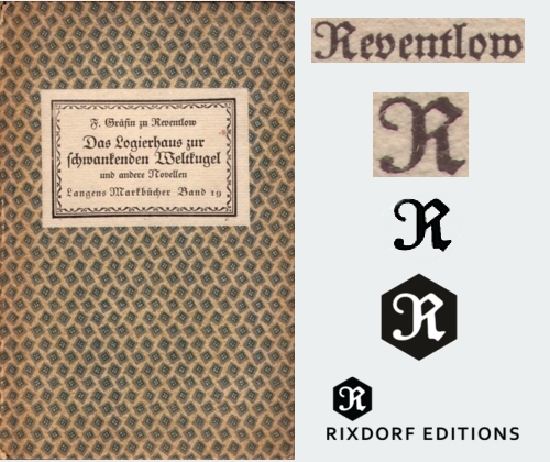
Let's start with our logo. The basic shape is a hexagon or – perhaps – a cube awaiting illumination to reveal its depth. The 'R', in the old German Fraktur script, is taken from the original first edition of one of our first titles, The Guesthouse at the Sign of the Teetering Globe (Das Logierhaus zur schwankenden Weltkugel, 1917), specifically the surname of the author, Franziska zu Reventlow, rendered here as F. Gräfin (Countess) zu Reventlow. Introducing Reventlow to an English-speaking readership is one of our proudest achievements, and we're just as pleased to have her as a guiding presence in our identity.
For the book covers, the idea was for the imagery to reflect the times in which the original books emerged (approx. 1890-1918) while avoiding pastiche. Series identity was key; it had to be readily apparent when looking at any two Rixdorf titles that they belonged together. And we wanted to have black backgrounds, partly because they look awesome, partly to reflect the idea of things appearing out of the dim past, much like the books they adorned were emerging from ill-deserved obscurity. The era in question was also the first golden age of postcards, and it is largely to this form that we turned for our graphic elements, having gathered hundred of examples from Berlin fleamarkets.
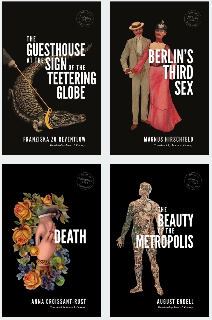
Our English edition of Reventlow's book is a good example of how we incorporate postcard art. One of the most arresting sequences in the collection comes from the title story, in which a reform-minded German eccentric leads a crocodile about on a leash. To represent this we found an old postcard from an establishment called the 'Restaurant zum Neuen Krokodil', which was a stone's throw from Frankfurt's main station, and bagged its scaly mascot for ourselves (incidentally, Google Street View reveals that the building is still standing although the ground floor is now occupied by a branch of the drugstore chain DM). Curiously, the name also echoes the guesthouse of the original German title. For the arm reaching in enigmatically from the side we used a New Year's greeting postcard; Cara diligently removed the snowflakes from the original. And she also suggested that – just this once – we break our self-imposed right-hand margin for the cover text; the word 'teetering' is teetering over the edge. The 'stamp' seen on each cover, another allusion to postcards, records the time and place that the original was written and/or published, in this case 1917 in the Swiss town of Ascona where Reventlow lived for the last eight years of her life.

Berlin's Third Sex by Magnus Hirschfeld was a far more challenging work to represent graphically. It covers so much ground – gay men, lesbians, transvestites, transsexuals, prostitution, the demi-monde, high society, nightlife, domestic harmony, law enforcement, blackmail, moral codes. How to get all that in one image? The short answer is you can't, so we decided to lightly recontextualise an example of the era's incredibly extensive and diverse courting imagery. For one half of our happy couple we simply substituted the head of a soldier in the emblematic 'Pickelhaube' helmet. This might seem glib, but in fact Hirschfeld's text reveals that incidents of gay men taking up with obliging soldiers were far from unknown in the era (although full disclosure: they were generally not in drag).

For our forthcoming translation of August Endell's The Beauty of the Metropolis, we tried something a little different. Picking up on the text's reference to 'the street as living entity' we turned this around to make a living entity composed of streets. The connection between the human body and the urban environment is hardly unprecedented ('heart/lungs of the city', 'arterial road'). The body in this instance is an anatomical diagram from a handbook of medical remedies entitled Pfarrer Heumann's Heilmittel, while the streets, parks and waterways are taken from a 1900 map of Berlin, the city referenced throughout Endell's book. Visible in this section are the Tiergarten, the River Spree and the Landwehr Canal, all of which find mention in the text.

Finally, for Anna Croissant-Rust's Death we returned to our postcard collection. As with the other examples here, the original artist is sadly uncredited. We changed the orientation of the postcard image, but decided it was strong enough not to need any additional elements. As well as the obvious association of death and flowers, and the trope of death as a romantic partner, the image also recalls the motif of joined hands sometimes seen in old mourning jewellery. But which is Death? Is the deceased being pulled up or down? You decide...
