

Our forthcoming title, Three Prose Works by Else Lasker-Schüler (20 June 2022), is the last in the current format of Rixdorf Editions, so we wanted to take a final look at the series design. First up: if you haven’t already, check out this blog post which covers the original design concept for our books as conceived by Cara Schwartz (and here you can also read up on the extraordinarily prophetic caricature that adorns our translation of Hermann Bahr’s Antisemitism).
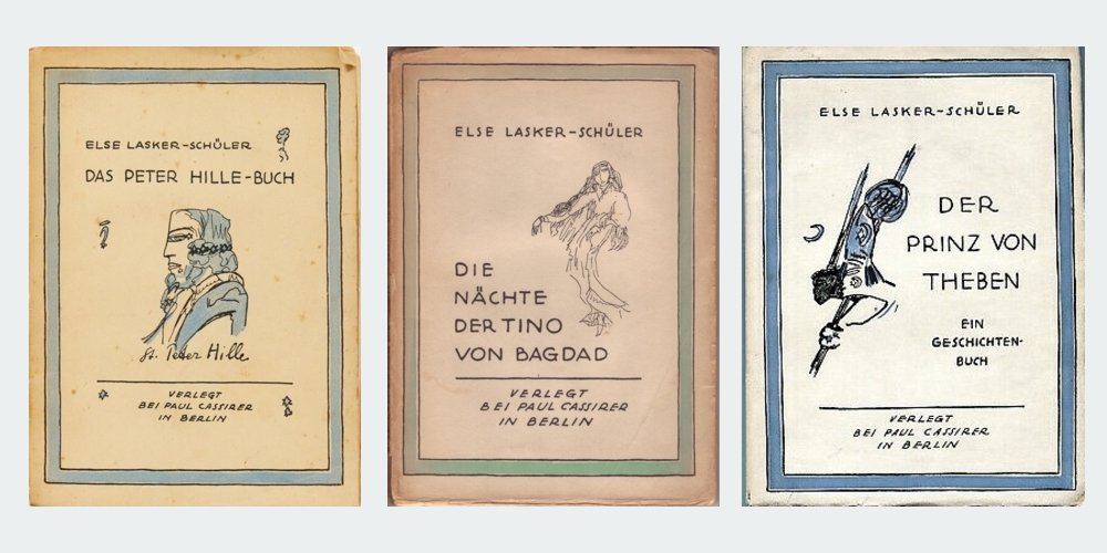
Like all of our books, the cover of Three Prose Works uses a black background and recontextualises imagery from around the time of publication, the early 20th century. And like all of the titles since 2019, it is designed by Svenja Prigge (you can see more of her work here). But perhaps before we look at our interpretation, we should see how Lasker-Schüler’s books appeared in her own time. The three works which make up our edition – The Peter Hille Book, The Nights of Tino of Baghdad and The Prince of Thebes – were all published prior to the First World War.
Das Peter Hille-Buch (The Peter Hille Book) was originally issued in German in 1906. Its cover bore a portrait of Hille himself as the one-eyed Norse god Odin by artist Franz Stassen, an image which had once adorned the wall of the cabaret in Berlin where Hille (and Lasker-Schüler) performed.

The cover of Die Nächte Tino von Bagdads (The Nights of Tino of Baghdad), which followed in 1907, simply bore the title in gold against a pink background. The frontispiece by Max Fröhlich, however, seems to illustrate the opening passage of the book (‘You must visit me three days after the rainy season, for the Nile has receded then, and great flowers shine in my gardens, and I too rise from the earth and breathe. A mummy am I, as old as stars, and I dance in the time of the leas. Solemn is my eye and prophetic rises my arm …’).

Else Lasker-Schüler was not just a writer, she was an artist as well, but what might seem a natural step – getting her to supply the cover images herself – didn’t occur until her epistolary novel Mein Herz (My Heart) in 1912. In 1914 the third of our three prose works, The Prince of Thebes, carried Lasker-Schüler’s own illustration, a Semitic vision of a warrior with a Star of David nestled in a crescent moon on his cheek and his helmet, flanked by a Black comrade. This edition featured a number of other line drawings by Else Lasker-Schüler along with three colour illustrations by her friend, the Expressionist painter Franz Marc.

After the First World War, these three titles along with seven others were issued in a complete edition of Lasker-Schüler’s work to that point by art dealer and publisher Paul Cassirer with cover images by the author; she re-used the illustration from The Prince of Thebes, but for the other two we can finally see how Lasker-Schüler herself visualised her works.
When we issued our translation of The Nights of Tino of Baghdad as a PDF-only release to our mailing list in 2019, Svenja Prigge’s design picked up on the motif of dance from the Cassirer edition, using an image from one of the thousands of collector cards produced in the early 20th century. A little larger than a standard business card, they were often richly coloured and issued in thematic sets as promotional extras with products like cigarettes and the ubiquitous ‘Leibig meat extract’. The marketing advantage presumably consisted in children collecting the cards and then asking their parents to keep buying the same brand so they could complete their sets. These collectibles are sold to this day; I found the well-preserved examples here at flea markets in Berlin.

Here the image comes from a card issued with ‘Zuntz’ brand coffee and tea, part of a set of scenes from One Thousand and One Nights, the great Arab narrative cycle which shares numerous motifs with Lasker-Schüler’s prose writing. The image was supplied by the Dresdner Kunstanstalt who were responsible for numerous collector cards, postcards and other ephemera from the era. This scene finds the character of Morgiana dancing for the chieftain of the notorious 40 thieves. The sensuality of this vignette is deceptive; Morgiana is about to stab the thief to death, echoing the violence which seems to inexorably follow each erotic encounter in The Nights of Tino of Baghdad.

This Orientalist aesthetic was typical of the time. As the Afterword to Three Prose Works describes, visual signifiers of an imagined Middle East were incredibly popular throughout high and low culture in early 20th-century Germany. Lasker-Schüler reported her delight at a Berlin circus which made use of these ‘Eastern’ motifs, so it was imagery with which she was certainly familiar. But she was also familiar with antisemitism, including the term ‘Oriental’ – a slur that bigots used to describe Jews. Lasker-Schüler’s response appears to have been to defiantly embrace this insult and transform it into a positive, constructing an ‘Oriental’ world in her writing and even in her day-to-day life.
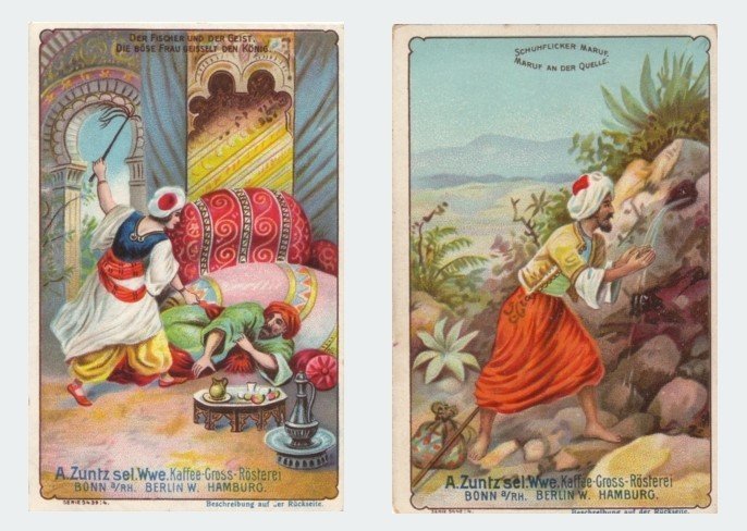
When we returned to Lasker-Schüler for Three Prose Works, we returned to the Zuntz One Thousand and One Nights set, with Morgiana now joined by the flagellant sorceress who is keeping the King of the Black Isles captive, and Maruf the cobbler at the spring. In place of the whip we gave the sorceress a pansy (taken from a botanical print); the character of Tino – who recurs in different guises throughout the Three Prose Works – is a fierce adversary but also susceptible to beauty.

The swirling figures pick up on the motif of dance which recurs throughout the three works, their weightlessness evokes the intoxicating disorientation of Lasker-Schüler’s prose, while their different forms represent the Orlando-like transformation that Tino undergoes. The cyclical momentum parallels the circular if fractured narrative that emerges throughout the three books. The pansy is the kind of flower to be found in the Nietzschean, Germanic forest settings of The Peter Hille Book, but the leaf on its stem resembles a palm tree, and points to the Orientalist journey ahead. By the time we end up in Jerusalem at the end of The Prince of Thebes, there are elements which seem to take us back to the source – quotes from Nietzsche and European flowers … and so it goes, round and round.

However it took a while to arrive at this arrangement; to prove that we really don’t rush into our designs, here are just some of the original alternatives.

As I mentioned in our original design round-up, the guiding concept for the Rixdorf Editions books was to have imagery from the time reconfigured on a black background, to suggest elements emerging from obscurity just as the works themselves were being rediscovered. And this is all true, but as this is the last cover in this format, it’s time I let you in on the original original inspiration:
Fuzzy-Felt.

If you’ve never encountered this low-tech children’s toy of yesteryear, Fuzzy-Felt came as a box full of coloured pieces of felt in different shapes which you could arrange into pictures in a lurid pop-folk style on a black felt background. I have a dim (yet clearly persistent) memory of playing with a care-worn Fuzzy-Felt set, which presumably belonged to one of my cousins, when I visited my aunt and uncle’s farm in rural South Australia. There was something about the suspension of carnivalesque elements against an unfathomable void which captured my young imagination. So there you go – it was Fuzzy-Felt all along.
Duly unburdened of that burning secret, it remains only for me to thank Cara Schwartz and Svenja Prigge for their expertise, taste and patience in producing these cover images over the last five years.

Three Prose Works by Else Lasker-Schüler (translated by James J. Conway) will be published on 20 June 2022