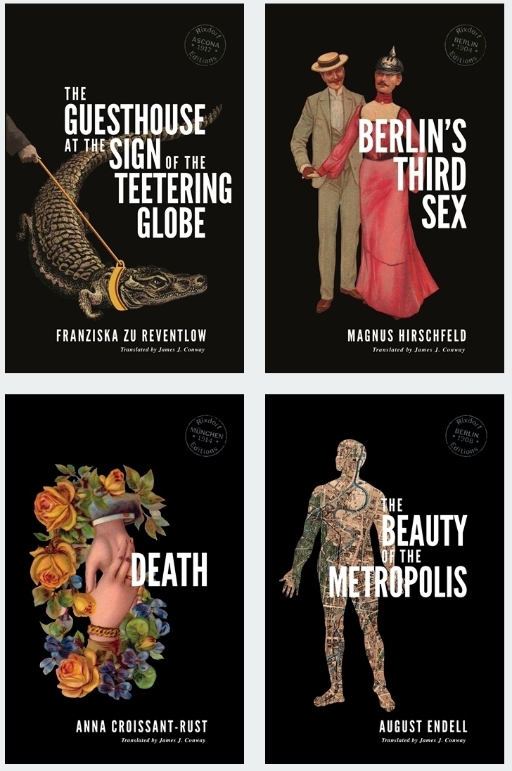
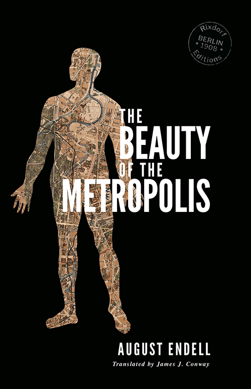
Architect, designer and theorist August Endell was born in Berlin 150 years ago today. In 2018 I translated and published his major text, The Beauty of the Metropolis, Endell’s love-letter to Berlin and to cities in general. Originally published in 1908, this visionary essay presented readers with new ways of looking at the urban environment. Also included in this edition were six articles that Endell wrote for the journal Die neue Gesellschaft in 1905 which show him arriving at the theses in his main work through meticulous observation and profound reflection.
What struck me when I first read The Beauty of the Metropolis and these articles was their force of prophecy, describing a way of seizing aesthetic ownership of our surroundings that felt extraordinarily contemporary. Lyrical and insightful, his words expressed thoughts I had harboured about the city, about belonging, about an engagement with culture and habitat that transcended nationhood. To mark Endell’s sesquicentenary I want to go even further back to two similarly oracular articles (plus a snippet), originally published either side of the beginning of the 20th century.

In 1897, August Endell was living in Munich, then Germany’s hub for avant-garde arts and letters, and was best known for a work of outspoken art criticism he had issued the year before, Um die Schönheit (On Beauty). In it Endell held that ‘those who learn to give in to their visual impressions completely, without associations, without secondary objects of any kind, those who just once feel the emotional impact of forms and colours, will find them to be an inexhaustible source of extraordinary, unimagined pleasure.’ Endell set out his primary aesthetic theories which remained remarkably consistent throughout his career, and attracted praise from the likes of Lou Andreas-Salomé.
Endell was in touch with the most progressive currents of Munich through his friends Anita Augspurg and Sophia Goudstikker, partners in business and life who ran a photo studio (the first solely female-owned business in Germany) from where they also operated a salon. For the November 1897 edition of Munich-based journal Dekorative Kunst (Decorative Art), Endell wrote ‘Freude an der Form’ (Joy in Form), a momentous text that made the case for abstraction in art – ‘forms that mean nothing and represent nothing and remind us of nothing’ – before artists themselves. He also equated this new art with music, the kind of association Wassily Kandinsky would apply when he actually made the first works acknowledged as non-figurative art on the eve of World War One, with titles referencing ‘compositions’ and ‘variations’ (even earlier abstract works by the likes of Hilma af Klint were not recognised at the time). Kandinsky, it should be noted, was active in the same bohemian Munich circles as Endell; in the late 1890s they lived on the same street in Schwabing, the city’s alternative centre of the time, and it is probable yet not conclusively proven that they knew each other.
‘Joy in Form’ was actually the opener of a three-part series under the rubric ‘Formenschönheit und decorative Kunst’ (Beauty of Forms and Decorative Art), which explains the inconclusive conclusion. The two other parts of the series were similarly ahead of their time, addressing ‘the straight line’ and ‘linear structures’ respectively. Endell then distilled his thoughts on this coming art into a highly potent dose – just one paragraph, under the heading ‘Formkunst’ (Art of Forms) stuck at the end of the March 1898 edition of Dekorative Kunst like an afterthought. Endell’s theories were still just theories, but not for long.

We catch up with Endell again in 1902, after he has returned to Berlin with bride Else Plötz (who later found cult renown as the ‘Dada Baroness’, Elsa von Freytag-Loringhoven). He has been very busy in the intervening years. He has left Munich behind, but also left it with a hugely radical structure, the most conspicuous and contested example of the new style known as Jugendstil – a refurbishment of the photo studio owned by his friends Augspurg and Goudstikker, the Fotoatelier Elvira. Its façade boasts a striking design resembling a dragon, a wave, or – nothing; art historian Erich Franz calls it ‘the first abstract work in art history’. Endell has also designed a sanatorium on the island of Föhr and the Buntes Theater in Berlin, writhing with the vegetal forms which were his specialty. In each case Endell insists on designing everything, including wall fixtures and furnishings, right down to individual door handles, in line with Jugendstil’s conception of itself as an all-enveloping solution to the built environment.
But the style was not widely adopted, and never threatened to unseat historicism as the dominant mode of public and private architecture in Germany. This was not just something in the air – it was a top-down command from Kaiser Wilhelm II himself, who loathed modern forms and was never shy of intervening in the cultural life of his subjects. Art and architecture, he held, had been perfected in the past, so all that was left for the creative professional was to combine these inherited forms in new ways; seeking to replace them, on the other hand, was ‘hubris’. Endell, who disdained historicism with comparable zeal, targeted the big guy himself in an open letter in February 1902.
Shortly after this, Endell turned his thoughts to ‘Originalität und Tradition’ (Originality and Tradition) for the journal Deutsche Kunst und Dekoration (German Art and Decoration). His piece was illustrated with his designs for the Buntes Theater and items of furniture, amid numerous other examples of high-end Jugendstil in the issue. In his article Endell renews his attack on historicism and defends modern currents in art and culture; the astute contemporary reader may have picked up on the reference to ‘hubris’ and other callbacks to the Kaiser’s pronouncements. But Endell also considers how new styles might be codified and communicated to create a new tradition that would replace vacuous pastiche.
Here, before Walter Gropius had even begun studying architecture, Endell calls for a fearless embrace of new forms, rejection of unreflective national pathos, an approach to design that reflects its age. He advocates a fusion of art, design and architecture stripped of mystical reverence, ‘concentration on forms and colours’, and a means of defining, refining, and consolidating new creative principles and transmitting them to the next generation. These are all qualities that the Bauhaus would come to embody almost two decades later. Endell comes close to ‘form follows function’ (the maxim coined by architect Louis Sullivan in 1896) but pulls away, unable to relinquish the inspiration of nature in ornament, refusing to see it as ‘brute barbarism’ – almost ten years before Adolf Loos equated ornament with crime. Yet here, as in his writings at the close of the previous century, he advocates a radical reduction and reassessment of means.
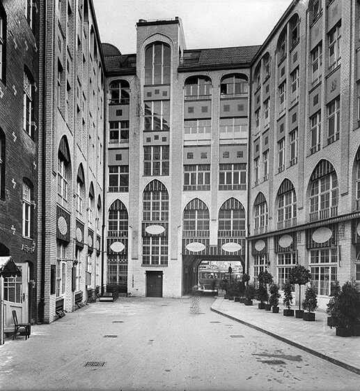
Two years later, Endell opened his own small ‘Formschule’ out of his apartment in Berlin, where he also wrote The Beauty of the Metropolis. By the time the First World War broke out Endell had enriched his city with a hotel, a racetrack and a design for the main courtyard of the Hackesche Höfe, which showed the growing concision of his design vocabulary. During the war, when the art and design school in Weimar was looking for a new director, August Endell was on the short list. Yet the job went to Walter Gropius, who transformed the school into the Bauhaus and sparked an aesthetic revolution in the young Weimar Republic and the entire world under principles which, even if they weren’t aware of it, had been proposed by August Endell.
Endell, meanwhile was granted directorship of a similar institution in Breslau (Wrocław) but, with his ever-fragile health declining further, he retired to Berlin, where he died in 1925.
August Endell
Joy in Form
translated by James J. Conway
In the increasingly vehement demand for a new style in architecture and applied arts, for a new, unique and autonomous means of decoration, we hear discordant voices of warning from cautious individuals who, from the lofty height of their mature experience and their perception, elucidated and deepened by extensive historical studies, smile pityingly at the foolish doings of the young and are always willing to show the public the one true path. They teach us that there can be no new forms, that all possibilities have been exhausted in the styles of the past, that all art consists in the use of all these forms with individual nuances. Yes, they even sell us the pitiful eclecticism of the last few decades as the new style.
To those who know, this want of courage seems merely ridiculous. Because they clearly see that we are not only at the beginning of a new stylistic period, but also at the beginning of the development of a completely new art; art with forms that mean nothing and represent nothing and remind us of nothing, which stir our souls as deeply, as strongly, as only music can do with sound.

The barbarian hates our music; it takes culture and education to enjoy them. And the joy of form must be attained; you must learn to see it, to immerse yourself in the form. We have to discover our eyes. It is true that people have long unconsciously delighted in form, its development can be clearly traced in the history of the visual arts, but it is not yet a permanent, captive possession. Painters have taught us much; but their primary goal was always colour, and wherever they looked for form, they mostly looked for the intellectually characteristic through an exact reproduction of its object, not the aesthetically characteristic which nature seldom offers in the dimensions a painter requires, and only accidentally.
If we wish to understand and measure formal beauty, we must learn to view it in isolation. It is to the details that we must direct our attention, to the shape of a tree root, to the base of a leaf, the stem, to the structure of tree bark, the lines forming the turbid foam on the shores of a lake. We must not glide carelessly over the forms, we must follow them closely with our eyes, witness every bend, every curve, every expansion, every contraction, in short every change in form. Because we only see precisely with one point in our field of vision, and only what we can see clearly can affect our emotions. But when we see in this way, a new, hitherto unknown world of enormous richness arises before us. It awakens a thousand moods in us. New sensations all the time with new nuances, unexpected transitions. Nature seems alive and we now understand that there really are such things as grieving trees and mischievously malicious branches, chaste grasses and terrifying flowers. Admittedly, not everything exerts such an impression, there is no lack of the dull, insignificant and ineffectual, but the watchful eye will perceive everywhere, in every field, forms of wondrous stimuli that shake our entire soul.

This is the power of form over our mind, a direct immediate effect with no intercessory links, certainly not the consequence of anthropomorphism, or personification. When we speak of a grieving tree, we by no means think of the tree as a living being that mourns, we merely believe that it arouses the sensation of grieving in us. Or if we say a fir tree is striving upwards, we are not investing it with a soul; expressing the occurrence of ‘striving’ merely makes it easier for the mind of the listener to generate the successively emerging image of the upright. These are simply linguistic stopgaps to replace the lack of words and to more readily evoke vivid perception.
Nor is it memory that gives forms their significance for our emotions. A circle may bring to mind the ring, and thus fidelity and eternity, but it can just as easily evoke bondage, serfdom and slavery, and so the circle arouses first one, then another sensation in us. But such sensations have as little significance for the art of forms as the memories that an individual associates with the notes of a flute have in music.

Also, one needn’t believe that the unconscious idea of the essence of an object only appears meaningful to us in its form. However, there is a certain parallelism between essence and appearance. A big tree seems strong to us, and it is. But it appears so to us long before we know its true strength. And form and inner being do not always correspond. An angry man often looks amusing enough and a hollow tree just as strong as a healthy one, stronger, even, and more colossal with its torn bark. The path does not lead from essence to appearance, no, it’s the reverse – the appearance offers us initial insight into the essence. We transfer the impression created by the form to the inner being of the object and, through the above-mentioned parallelism, we are usually correct. Think for instance of the instinctive fear felt by animals and children. The form immediately arouses the sensation, there is no intervening psychological event of which we are aware. And unconscious events explain everything and precisely for that reason – nothing.
‘But then how do we explain the sensation of form?’ – it is the ones who have never experienced it who ask this the loudest. I could answer, but this is not the place for that; you can enjoy music without knowing how chords and chord progressions are able to rouse us so powerfully. However, in order to calm the sceptics and make it easier for them to enter the world of forms, I will attempt to describe the effects of sensation in their formal elements and compositions and at least suggest a psychological explanation, to the extent that one may do so without lengthy discussion.
August Endell
Art of Forms
translated by James J. Conway
There is an art which nobody seems to know about yet: the art of forms, which stirs people’s souls solely through forms that do not resemble anything known, that do not represent or symbolise anything, which operate through freely found forms like music through free sounds. But people don’t wish to know about it, they cannot enjoy that which their intellect fails to understand, and so they invented programme music, which means something, and programme decoration, which resembles something, to prove their right to exist. And yet there will come a time when monuments will rise up in parks and public places that are neither people nor animals, fantastical forms which will transport people to intoxicating rapture and unimagined delight.
August Endell
Originality and Tradition
translated by James J. Conway
The advocates of newer artistic endeavours stand accused, ad nauseam, of disregarding all traditions, of seeking to start from scratch with no models whatsoever, of looking down on all past artistic practice with contempt, and refusing to profit from past experience as a matter of principle. Over and over we hear that art and proficiency existed before our times and that to ostentatiously set oneself above these past treasures is a ridiculous craving for originality, arrogance and boundless hubris. Well, the evil moderns are not as bad as all that, but it cannot be denied that they in fact have made it their ambition to invent the forms they use themselves, although not by assembling them from books or even with the help of photographs or casts. But is that really so outrageous? We would readily mock a poet, a composer, a painter or sculptor if he were naive enough to copy existing art works in whole or in part and then issue them as his own. In architecture, however, not only are we to allow this, it is to be the only possible form of artistic work. Admittedly, work in architecture and the applied arts more often leads to the use of alien forms than other areas; partly because the need for such work is infinitely large by comparison, and also because truly original artists are as rare here as anywhere else.
Added to this is the technical difficulty and the high cost of execution, which greatly restrict if not nullify the opportunities for trying out case by case, and it stands to reason that once someone has found the artistic solution for overcoming a technical difficulty – for instance in a door lintel or a vault – others will readily follow in the same direction. And so there is indeed a greater stability of forms in architecture than in other arts. That is why we only speak of styles, in the true sense, in architecture and applied arts. But closer inspection reveals this stability to be merely illusory, and in times of vibrant artistic spirit, innumerable variations can be found within a given style. We know, for example, that in the mid-19th century the lone master carpenter would make it his ambition to give each new customer a new shape of chair. This was an entirely healthy form of applied arts and one could never seriously object to this kind of re-creation; it is in the nature of things. But it is not here that the moderns direct their polemic, but against the hideous, ‘scientifically precise’ imitation of old stylistic forms. For the reproduction will seldom be precise and the want of love in the creation will scarcely escape the attentive eye. There is a difference between giving of your own and stealing something else. Stealing is not a creative activity. But even if ‘the perfected means of the present day’ should render the imitation precise, this still leaves the incongruity between the stolen and the self-fashioned, because unfortunately in earlier times they were not kind enough to build model houses and cupboards that reflected the needs of their grandchildren. And so we are left with no alternative but to at least design the form of our rooms and their sequence ourselves. Our external life alone differs in a thousand ways from the life before us, through our changed relations with each other, our commercial life and not least the lighting we have developed. Even more important are the completely distinct social stratification, the unique pace of our life and the fundamentally different balance to our life and our happiness.

All of this requires individual expression and truly it is better to be awkward and clumsy in expressing your own longings and desires than to feign artistry with stolen forms or to erect ostentatious buildings which, through their mendacity, are suited only to revealing the saddest qualities of our time. So there’s nothing for it, we really do need new forms.
In the past they responded by claiming that all forms were exhausted and that it was simply impossible to create anything new. No one would dare say that now. But the erstwhile devotees of these ideas declare simplicity, elegantly unadorned, to be the only worthwhile goal worth striving for. Ornament is secondary, brute barbarism even. Sadly the heralds of this doctrine offer little that is pleasing, and that little is stolen from the Biedermeier style, from the English and from the Americans. Naturally, the smooth angularity of these forms in combination with fine materials is astonishing. But after a while one senses this blasé scepticism, essentially too cowardly to live and to create, to be a sterile aberration. Inventing simple forms is not at all easy, and such forms cannot be the inception but only the fruit of long and intensive endeavour. First we have to learn to operate through complicated structures until we are sure enough to express a lot even with simple means. Of course, the supporters of that direction accuse the newer style of gimmickry and obtrusion. It is quite clear that every new thing that was created without models and on the basis of principles that had never before been followed is surprising in its effect, quite apart from any artistic element. The unfamiliar is simply conspicuous, and the viewer lacks all prerequisites and criteria by which to judge the congruity of the individual piece, since the very aim is newness by principle, and this principle is neither recognised nor acknowledged. But it is a rather disdainful tactic to interpret this fact as a base craving for admiration on the part of the new. Naturally every artist wishes to be noticed, but one must not forget that it also takes a little courage to apply a new, alien principle as a statute for one’s own work when no one can judge the effect in advance and everything is called into question; artistic reputation – not to mention material subsistence. For the rest, however, we don’t always need to conflate these questions with moral considerations right from the start.

Of course, the moderns will often fail, exposing them to the ridicule of older colleagues. This results from the enormous difficulties in seeking your own salvation on a new pathway. We lack all support and, above all, every tradition. Because in reality the matter is this: it was not the moderns who destroyed tradition; tradition was destroyed by the conscious copyists of the 19th century, by the imitators of the Hellenic and the Renaissance, the Gothic and the other historical schools. This is because formulae for assembling new buildings in endless variations from drawing templates, photographs and casts really have nothing in common with artistic tradition; there is only one tradition for the artist and that is the tradition of artistic creation. One must see in person how an artist overcomes problems and obstacles. Only through such direct transferral can artistic sensibility and artistic proficiency be passed down from generation to generation and develop over time to ever greater richness, greater sharpness and surety. The passing down of rules and laws of craft, a perfect, precise, detailed handicraft tradition; for art is craft, a highly complex craft, yes, but one that by all means can be taught and learned through teaching. We must emphasise this, particularly nowadays, when time and again art is raised to the heavens as a mystical achievement, as a miracle and – despised, a view that has caused the most grievous damage to our entire artistic life. Art is nothing but work; it requires nothing more than a complete, detailed knowledge of the artistic effect; it demands unconditional, passionate devotion and awe. But it is not the product of erratic genius or even of unexpected ‘moods’. You can always tell dilettantes by their need for mood.
Certainly, learning arts and crafts is made far more difficult by the fact that we have no traditional rules and laws, and it must therefore be our most earnest endeavour to gain them and to ensure their general dissemination. This should first include a precise description of the tools and methods for studying nature, for seeking inspiration from past and foreign cultures, and above all a systematic knowledge of forms and colours. And naturally no more generalised phrases, not even the aesthetic phrases repeated ad nauseam about ‘construction’, about ‘simplicity’, about ‘material authenticity’, about ‘practicality’, the golden ratio or similarly fine things. Also no doctrines of male or female art, of the representation of ideals or the embodiment of historical ideas or even of the cosmos itself and the creation of the world. Instead we need clear, sober answers to the questions that the work presents to us. How you make a line hard, how you make it soft, calm, noble, smooth, elegant, how you make an ornament appear lighter and how you make it heavy. How heavy elements can be brought into harmony with each other. How you transform a vertical orientation into a horizontal orientation. How you make an outward protruding ornament float in the opposite direction. How you enrich a line, how you branch it out, how you arrange a bundle of lines, how far you can go in detail without negating the overall effect, and so on. In short, sure training of the eye for the effects of shape and colour. Only systematic practice and rigorous training will lead us there. Of course, initially we moderns can only pass on our own experience.
‘Joy in Form’ by August Endell was originally published in German as ‘Die Freude an der Form’, part of the series ‘Formenschönheit und dekorative Kunst’ (Beauty of Form and Decorative Art) in Dekorative Kunst, vol. 1, no. 2 (2 November 1897); ‘Art of Forms’ by August Endell was originally published in German as ‘Formkunst’ in Dekorative Kunst, vol. 1, no. 6 (6 March 1898). ‘Originality and Tradition’ by August Endell was originally published in German as ‘Originalität und Tradition’ in Deutsche Kunst und Dekoration, vol. 9, no. 6 (March 1902).
These translations © 2021 James J. Conway