Design

Images of Jussuf

One of the many fascinating things about Else Lasker-Schüler’s career is that through her dynamic, luminous illustrations, we have an insight into how she herself saw the characters who appear in her writings. In particular, the biblical figure of ‘Jussuf’ (Joseph/Jusuf, the favoured son of Jacob with the coat of many colours) looms large over both her graphic and written work. As the afterword to Three Prose Works reveals, Joseph was a persona of life-long identification for Else Lasker-Schüler, one that connected her to her brother Paul and her mother Jeanette, the two family members to whom she was closest. Paul taught the young Else the story of Joseph and his brothers, which she would in turn act out for her mother. Joseph was also associated with her early socialisation; when she told the story at school, a classmate mockingly declared that Else was Joseph.

That more or less came true shortly before the First World War; in a distressing phase of transition he became an alter ego to the writer and artist, although she fused the biblical figure with a fictional ‘Prince of Thebes’. This hybrid character not only turned up in Lasker-Schüler’s writing (most notably of course in The Prince of Thebes, issued in 1914 – the third of our Three Prose Works) but also her correspondence and numerous artworks. These images constitute a rich iconography spanning over 20 years, reappearing throughout the Weimar Republic and later accompanying Lasker-Schüler into exile.


Pre-World War One

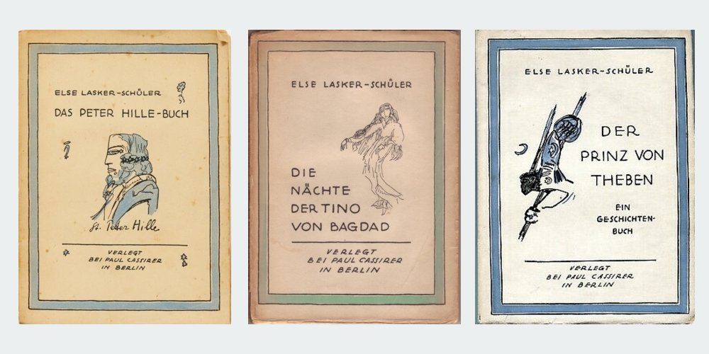
It was in 1912, triggered by her painful split from second husband Herwarth Walden, that Else Lasker-Schüler reached back and reconnected with Joseph (Jussuf)/Prince of Thebes. The ‘self-portrait’ that adorned an edition of the journal Saturn the following year is a kind of ‘coming out’ of the writer’s new persona. He is shown in profile, as he would be in the majority of later images as well. He is frequently accompanied by a crescent moon or a Star of David, or more often both – shorthand for the Semitic realm in which Lasker-Schüler places her prince (see for example the cover of The Prince of Thebes, 1914). The images themselves are sometimes rendered in a few strokes which emphasise a strong brow and down-turned mouth which he shares with his creator. Once fixed, these features remained remarkably consistent.

In a postcard to Georg Trakl, sent a few months before the war which would claim the doomed poet in its early stages, we see how Jussuf/Prince of Thebes appears in Lasker-Schüler’s correspondence. For the rest of her life she often signed her letters with some variant on these names.


1913 | An edition of the journal Saturn entirely dedicated to Lasker-Schüler’s work


1913 | ‘The Prince of Thebes heads into holy battle’


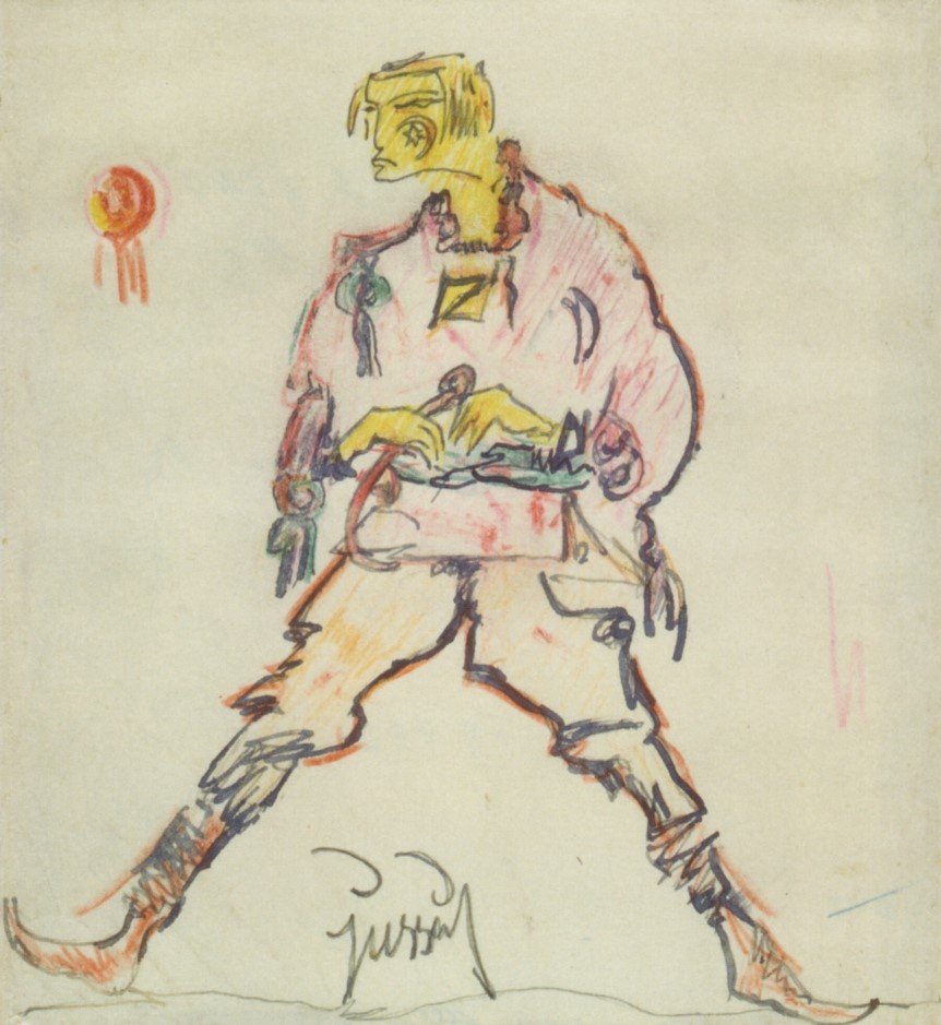
1913 | ‘Jussuf Prince Tiba’


1913 | Self-portrait as Prince Jussuf


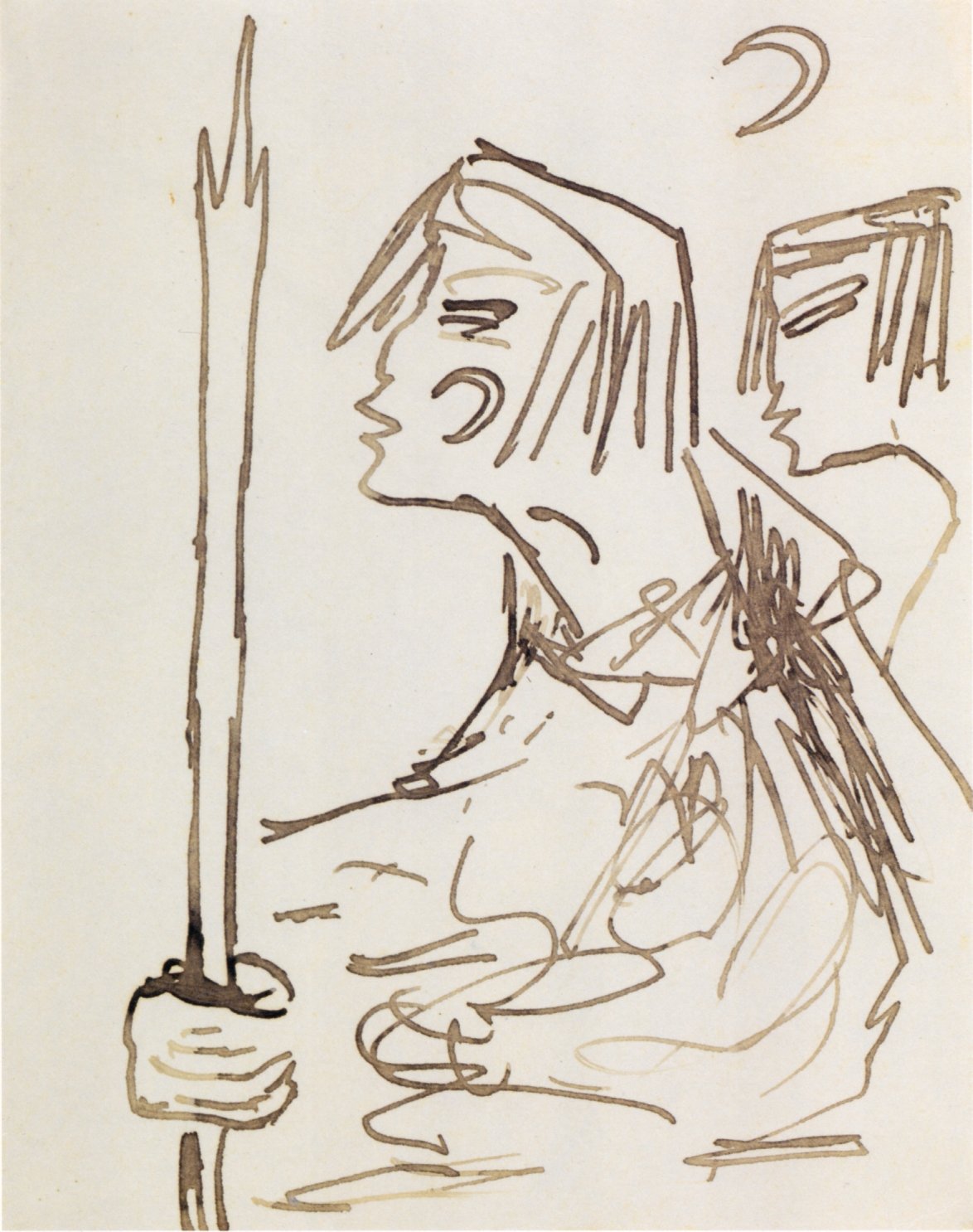
1913/14 | ‘Jussuf with spear’


1914 | Postcard addressed to Georg Trakl


Weimar Republic

During the First World War, Else Lasker-Schüler exhibited her art for the first time, and her work in the 1920s signals her confidence as a visual artist. Jussuf recurs throughout the Weimar period, although in contrast to the martial figure of the pre-war era the depictions tend to emphasise his sensitivity. He is often paired with animals (recalling his original role as a shepherd) and in one depiction the prince admires a blue rose, blue being an emotionally charged colour in Lasker-Schüler’s world. In the 1920s he appears more often in full length, a lithe physical presence, and the treatments advance from the pen sketches that dominate early depictions to more elaborate, appropriately many-coloured images in paint and even gold leaf.

Jussuf appears in different forms in the 1923 volume Theben, arguably the consummate union of Else Lasker-Schüler’s words and images. It featured hand-written verse in facsimile accompanied by illustrations, with 50 copies additionally hand-coloured by the writer/artist herself (even the uncoloured editions can sell for around EUR 10,000 these days). Theben was issued by the publisher Querschnitt, which was owned by the prominent gallerist Alfred Flechtheim – a key figure in the dissemination of Modernism in Germany.


1920 | ‘Asser Memed Schalomein Jussuf’


1920 | ‘Jussuf sculpts his mother’


1921 | ‘This is Jussuf in the evening full of longing’


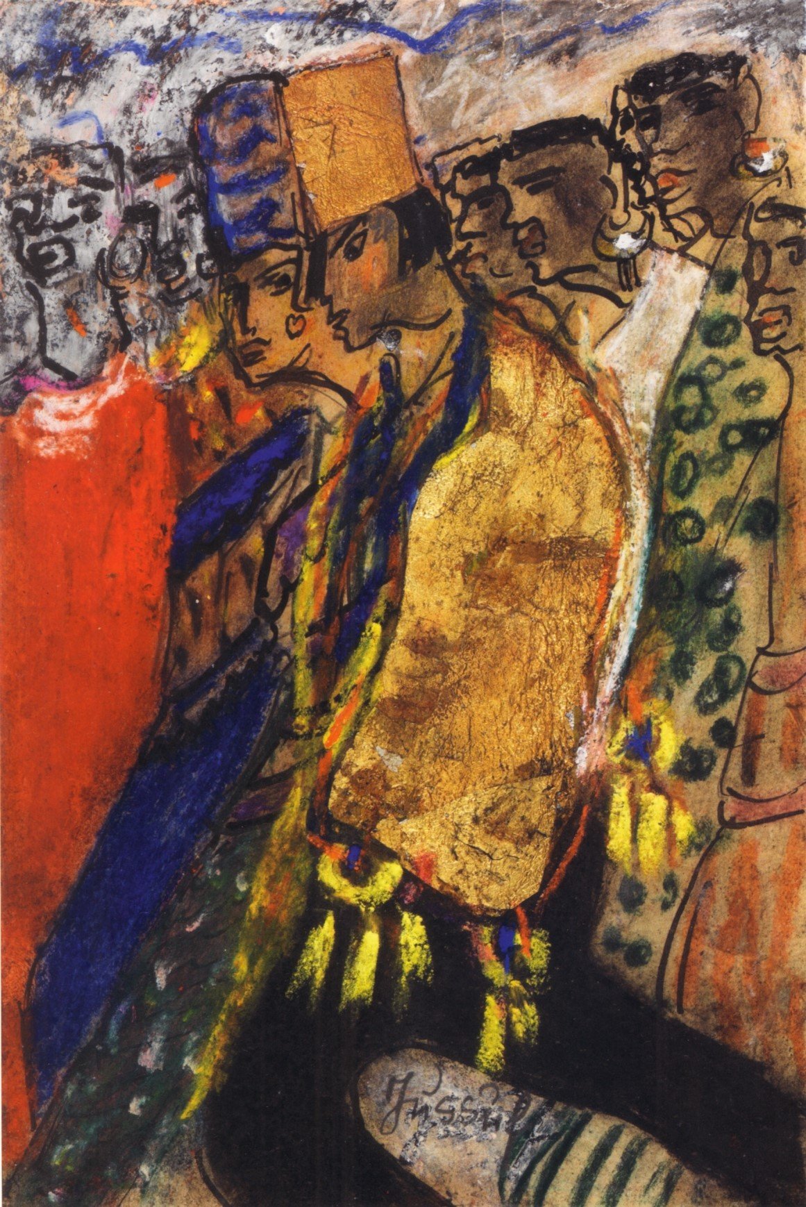
1922 | ‘Thebes with Jussuf’ (from the book Theben, 1923)


1923 | ‘Jussuf goes to God’ (from the book Theben, 1923)


1927 | ‘Jussuf’


1927 | ‘Jussuf tending the goats in pasture’


1927/28 | ‘Elephant with Jussuf’


Exile

Else Lasker-Schüler left Germany in April 1933, shortly after the Nazi takeover. Despite the penurious conditions under which she endured exile in Zurich, and later Jerusalem, she continued to write and produce art. An unusual image from 1935 returns us to the word, with Jussuf – in something like Western costume – reading his verse. The final sketch, which shows Jussuf praying for peace, is undated but may have been created around the beginning of Else Lasker-Schüler’s residency in Jerusalem, at the outbreak of the Second World War.


1934 | ‘Prince Jussuf of Thebes’


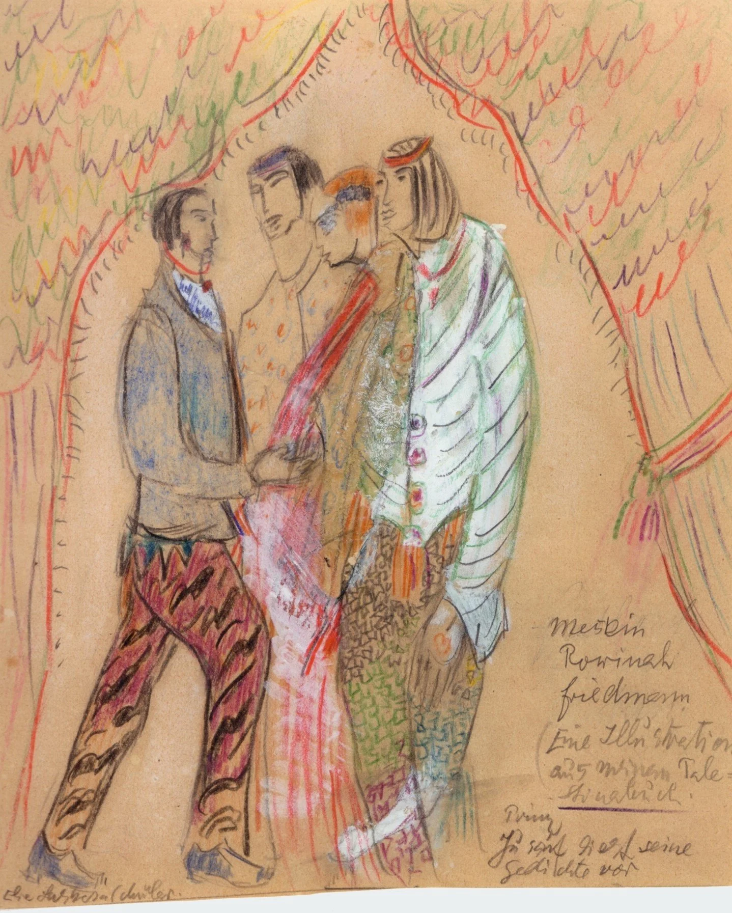
1935 | ‘Prince Jussuf reads his verses aloud’


1939(?) | ‘Prince Jussuf prays for peace in the world’

Back to black

Our forthcoming title, Three Prose Works by Else Lasker-Schüler (20 June 2022), is the last in the current format of Rixdorf Editions, so we wanted to take a final look at the series design. First up: if you haven’t already, check out this blog post which covers the original design concept for our books as conceived by Cara Schwartz (and here you can also read up on the extraordinarily prophetic caricature that adorns our translation of Hermann Bahr’s Antisemitism).

Like all of our books, the cover of Three Prose Works uses a black background and recontextualises imagery from around the time of publication, the early 20th century. And like all of the titles since 2019, it is designed by Svenja Prigge (you can see more of her work here). But perhaps before we look at our interpretation, we should see how Lasker-Schüler’s books appeared in her own time. The three works which make up our edition – The Peter Hille Book, The Nights of Tino of Baghdad and The Prince of Thebes – were all published prior to the First World War.

Das Peter Hille-Buch (The Peter Hille Book) was originally issued in German in 1906. Its cover bore a portrait of Hille himself as the one-eyed Norse god Odin by artist Franz Stassen, an image which had once adorned the wall of the cabaret in Berlin where Hille (and Lasker-Schüler) performed.

The cover of Die Nächte Tino von Bagdads (The Nights of Tino of Baghdad), which followed in 1907, simply bore the title in gold against a pink background. The frontispiece by Max Fröhlich, however, seems to illustrate the opening passage of the book (‘You must visit me three days after the rainy season, for the Nile has receded then, and great flowers shine in my gardens, and I too rise from the earth and breathe. A mummy am I, as old as stars, and I dance in the time of the leas. Solemn is my eye and prophetic rises my arm …’).

Else Lasker-Schüler was not just a writer, she was an artist as well, but what might seem a natural step – getting her to supply the cover images herself – didn’t occur until her epistolary novel Mein Herz (My Heart) in 1912. In 1914 the third of our three prose works, The Prince of Thebes, carried Lasker-Schüler’s own illustration, a Semitic vision of a warrior with a Star of David nestled in a crescent moon on his cheek and his helmet, flanked by a Black comrade. This edition featured a number of other line drawings by Else Lasker-Schüler along with three colour illustrations by her friend, the Expressionist painter Franz Marc.

After the First World War, these three titles along with seven others were issued in a complete edition of Lasker-Schüler’s work to that point by art dealer and publisher Paul Cassirer with cover images by the author; she re-used the illustration from The Prince of Thebes, but for the other two we can finally see how Lasker-Schüler herself visualised her works.

When we issued our translation of The Nights of Tino of Baghdad as a PDF-only release to our mailing list in 2019, Svenja Prigge’s design picked up on the motif of dance from the Cassirer edition, using an image from one of the thousands of collector cards produced in the early 20th century. A little larger than a standard business card, they were often richly coloured and issued in thematic sets as promotional extras with products like cigarettes and the ubiquitous ‘Leibig meat extract’. The marketing advantage presumably consisted in children collecting the cards and then asking their parents to keep buying the same brand so they could complete their sets. These collectibles are sold to this day; I found the well-preserved examples here at flea markets in Berlin.


Here the image comes from a card issued with ‘Zuntz’ brand coffee and tea, part of a set of scenes from One Thousand and One Nights, the great Arab narrative cycle which shares numerous motifs with Lasker-Schüler’s prose writing. The image was supplied by the Dresdner Kunstanstalt who were responsible for numerous collector cards, postcards and other ephemera from the era. This scene finds the character of Morgiana dancing for the chieftain of the notorious 40 thieves. The sensuality of this vignette is deceptive; Morgiana is about to stab the thief to death, echoing the violence which seems to inexorably follow each erotic encounter in The Nights of Tino of Baghdad.

This Orientalist aesthetic was typical of the time. As the Afterword to Three Prose Works describes, visual signifiers of an imagined Middle East were incredibly popular throughout high and low culture in early 20th-century Germany. Lasker-Schüler reported her delight at a Berlin circus which made use of these ‘Eastern’ motifs, so it was imagery with which she was certainly familiar. But she was also familiar with antisemitism, including the term ‘Oriental’ – a slur that bigots used to describe Jews. Lasker-Schüler’s response appears to have been to defiantly embrace this insult and transform it into a positive, constructing an ‘Oriental’ world in her writing and even in her day-to-day life.

When we returned to Lasker-Schüler for Three Prose Works, we returned to the Zuntz One Thousand and One Nights set, with Morgiana now joined by the flagellant sorceress who is keeping the King of the Black Isles captive, and Maruf the cobbler at the spring. In place of the whip we gave the sorceress a pansy (taken from a botanical print); the character of Tino – who recurs in different guises throughout the Three Prose Works – is a fierce adversary but also susceptible to beauty.

The swirling figures pick up on the motif of dance which recurs throughout the three works, their weightlessness evokes the intoxicating disorientation of Lasker-Schüler’s prose, while their different forms represent the Orlando-like transformation that Tino undergoes. The cyclical momentum parallels the circular if fractured narrative that emerges throughout the three books. The pansy is the kind of flower to be found in the Nietzschean, Germanic forest settings of The Peter Hille Book, but the leaf on its stem resembles a palm tree, and points to the Orientalist journey ahead. By the time we end up in Jerusalem at the end of The Prince of Thebes, there are elements which seem to take us back to the source – quotes from Nietzsche and European flowers … and so it goes, round and round.

However it took a while to arrive at this arrangement; to prove that we really don’t rush into our designs, here are just some of the original alternatives.

As I mentioned in our original design round-up, the guiding concept for the Rixdorf Editions books was to have imagery from the time reconfigured on a black background, to suggest elements emerging from obscurity just as the works themselves were being rediscovered. And this is all true, but as this is the last cover in this format, it’s time I let you in on the original original inspiration:

Fuzzy-Felt.


If you’ve never encountered this low-tech children’s toy of yesteryear, Fuzzy-Felt came as a box full of coloured pieces of felt in different shapes which you could arrange into pictures in a lurid pop-folk style on a black felt background. I have a dim (yet clearly persistent) memory of playing with a care-worn Fuzzy-Felt set, which presumably belonged to one of my cousins, when I visited my aunt and uncle’s farm in rural South Australia. There was something about the suspension of carnivalesque elements against an unfathomable void which captured my young imagination. So there you go – it was Fuzzy-Felt all along.

Duly unburdened of that burning secret, it remains only for me to thank Cara Schwartz and Svenja Prigge for their expertise, taste and patience in producing these cover images over the last five years.


Three Prose Works by Else Lasker-Schüler (translated by James J. Conway) will be published on 20 June 2022

Who was Édouard Drumont?

 
Hermann Bahr Antisemitism 9783947325108.jpg
 

When it came to designing our next book, Antisemitism by Hermann Bahr (originally published in 1894), finding an appropriate image proved challenging. How best to depict this utterly ground-breaking set of interviews concerning anti-Jewish sentiment of the 1890s that encompassed much of western Europe in its scope? One alternative might have been to explore the grotesque antisemitic caricatures that appeared in a number of publications of the time, particularly in Germany and France. Parisian newspaper La Libre Parole, for instance, popularised the kind of imagery seen in the worst antisemitic propaganda to this day – big-nosed Jews grasping, pulling strings, bleeding nations dry.

But rather than perpetuating these images, wouldn’t it be better to put the focus on those who were actually peddling these tropes? French writer Édouard Drumont, for instance. Born in 1844, he was perhaps the most prominent antisemite of his time in Europe. In fact it was he who founded La Libre Parole, in 1892. This followed the ‘Antisemitic League’ which he established in 1889, and his most lasting contribution to the cause, the extensive and popular book La France Juive (Jewish France), which appeared in 1886. One of his numerous targets in that book was the French-Jewish journalist and newspaper proprietor Arthur Meyer – one of Bahr’s interviewees – who challenged him to a duel.

France_juive_(affiche_édition_illustrée).jpg

Drumont was instrumental in arousing public outrage during the Panama Scandal that followed the first, failed attempt to build a canal through Panama in which France lost huge amounts of money, sometimes in deals of questionable legality. Drumont believed that Jewish conspirators were behind the whole affair, recklessly accusing public figures of underhand dealings for which he received a three-month prison sentence in 1892. The story was still dragging on as Bahr conducted his interviews, and while Drumont himself wasn’t among the 38 respondents, he was frequently cited by those who were, including French journalist Francis Magnard:

Antisemitism is an invention of Mr Édouard Drumont – by which I mean, of course there has always been anti-Jewish sentiment, prejudice and hatred, but it was only ever a purely personal matter. You liked the Jews, or you did not, as you saw fit – it had nothing to do with politics. It was Drumont who first created, discovered political antisemitism, and it was only with La France Juive that it came to life. Drumont turned his individual antipathy into a general principle …

 
Édouard Drumont.jpg
 

But elsewhere Magnard describes Drumont as ‘passionate, immoderate, yet gallant and honourable’, consistent with others who found admirable qualities in him even while deploring his monomaniacal hatred of Jews. They included another interviewee, French journalist Séverine, who described him as ‘brave, passionate, strong and chivalrous’.

So: back to the cover. We wanted the artwork to match our previous books, for which the imagery was largely drawn from postcards of the era (incidentally today marks 150 years since the first postcard was sent, in Bahr’s native Austria). And then we stumbled upon an extraordinary, deceptively playful postcard that depicts Drumont, which we presume to have been produced around 1890. The illustrator is Philippe Norwins, of whom little information survives, except that he worked for a number of journals around the beginning of the 20th century and seemed to specialise in caricatures of prominent French figures of the day.

Drumont postcard.jpg

The caption for his image of the French writer reads ‘Drumont anéantit ses mites’, a play on ‘Drumont, un antisémite’ which literally translates as ‘Drumont annihilates his moths’. We see the writer with an outsized pen in one hand, dripping black ink, and in the other an implement with which he sprays what we can presume is a deadly chemical agent, targeted at conspicuously big-nosed insects, one of whom has fallen dead at his feet. The victims are depicted as dehumanised, as vermin, and decades before the gas chambers this single illustration takes us from word to deed, from the polemics of hatred to the obscenity of genocide. And it is this image of shocking if accidental prescience that now adorns our translation of Antisemitism, designed by Svenja Prigge (like the cover for our recent edition of The Nights of Tino of Baghdad by Else Lasker-Schüler).

The Dreyfus Affair erupted in 1894, just as Bahr’s 1893 interviews were being published in book form. It was a scandal tailor-made for Drumont, and in fact it was his Libre Parole that broke the original story which would come to engulf French society in a bitterly rancorous dispute for years. Drumont was the most vocal and fanatical of the numerous French public figures decrying Jewish ‘treachery’ following the (false) accusations against Captain Dreyfus. Drumont was later elected to the Chamber of Deputies as a representative of Algiers, and tried (unsuccessfully) to repeal the law that had conferred French citizenship on Jewish Algerians. Failing to be re-elected in 1902 Drumont returned to his writing, and narrowly missed out on a seat on the august Académie française.

Édouard Drumont died in 1917; among the mourners at his funeral was Arthur Meyer.


Antisemitism by Hermann Bahr, originally published in German in 1894, is appearing in English for the first time on 21 October 2019 (translated by James J. Conway), Rixdorf Editions

Wish you were hier

postcard.jpg

As well as using old postcards in our artwork, we have recently started using postcards to make... postcards. Specifically, a series of art cards offering variations on original motifs of German postcards from around the beginning of the 20th century.

Why?

Well, one of our central aims with the whole Rixdorf Editions project is to introduce a combination of time and place largely unfamiliar in the English speaking world (Wilhelmine Germany) and show how it was actually a crucible for progressive thought that exerted an unacknowledged influence on later eras from the Weimar Republic to the present day.

postcard 2.jpg

Taking original imagery from the time and cropping, blowing up and amplifying the colour symbolises this process by liberating the latent Modernism of the age. There are the dots seen in close up which foretell everything from Pointillism to Pop Art. There are the mismatched colour registrations and their evocative suggestion of new and dynamic graphic realms. And even when (actually especially when) catering to mass market tastes, there are surreal juxtapositions of imagery.

The first series of eight cards is called 'Landscape', referring to both the format and the subject matter, with the source material depicting scenic splendour throughout Germany from Heligoland to the Bavarian Alps. Some of the original cards were photographs, some illustrations, some a strange amalgam of the two.

Anyway, it's just an experiment for now. We'll be including a selection of postcards with each online order until we run out.

postcard 3.jpg

Back in black

We've had some highly gratifying feedback since the first two Rixdorf titles were released to the world in November 2017, but one thing that people never fail to mention is the artwork by designer Cara Schwartz. So with our next two titles imminent we thought we'd give you an insight into how these designs came about, what we're aiming for, what we're drawing from.

Publisher/translator James J. Conway and designer Cara Schwartz at the Rixdorf Editions launch, Berlin, November 2017 (photo: Hilmar Schmundt)

Publisher/translator James J. Conway and designer Cara Schwartz at the Rixdorf Editions launch, Berlin, November 2017 (photo: Hilmar Schmundt)

Let's start with our logo. The basic shape is a hexagon or – perhaps – a cube awaiting illumination to reveal its depth. The 'R', in the old German Fraktur script, is taken from the original first edition of one of our first titles, The Guesthouse at the Sign of the Teetering Globe (Das Logierhaus zur schwankenden Weltkugel, 1917), specifically the surname of the author, Franziska zu Reventlow, rendered here as F. Gräfin (Countess) zu Reventlow. Introducing Reventlow to an English-speaking readership is one of our proudest achievements, and we're just as pleased to have her as a guiding presence in our identity.

logo evolution.jpg

For the book covers, the idea was for the imagery to reflect the times in which the original books emerged (approx. 1890-1918) while avoiding pastiche. Series identity was key; it had to be readily apparent when looking at any two Rixdorf titles that they belonged together. And we wanted to have black backgrounds, partly because they look awesome, partly to reflect the idea of things appearing out of the dim past, much like the books they adorned were emerging from ill-deserved obscurity. The era in question was also the first golden age of postcards, and it is largely to this form that we turned for our graphic elements, having gathered hundred of examples from Berlin fleamarkets.

Rixdorf four covers.jpg

Our English edition of Reventlow's book is a good example of how we incorporate postcard art. One of the most arresting sequences in the collection comes from the title story, in which a reform-minded German eccentric leads a crocodile about on a leash. To represent this we found an old postcard from an establishment called the 'Restaurant zum Neuen Krokodil', which was a stone's throw from Frankfurt's main station, and bagged its scaly mascot for ourselves (incidentally, Google Street View reveals that the building is still standing although the ground floor is now occupied by a branch of the drugstore chain DM). Curiously, the name also echoes the guesthouse of the original German title. For the arm reaching in enigmatically from the side we used a New Year's greeting postcard; Cara diligently removed the snowflakes from the original. And she also suggested that – just this once – we break our self-imposed right-hand margin for the cover text; the word 'teetering' is teetering over the edge. The 'stamp' seen on each cover, another allusion to postcards, records the time and place that the original was written and/or published, in this case 1917 in the Swiss town of Ascona where Reventlow lived for the last eight years of her life.

Guesthouse evolution.jpg

Berlin's Third Sex by Magnus Hirschfeld was a far more challenging work to represent graphically. It covers so much ground – gay men, lesbians, transvestites, transsexuals, prostitution, the demi-monde, high society, nightlife, domestic harmony, law enforcement, blackmail, moral codes. How to get all that in one image? The short answer is you can't, so we decided to lightly recontextualise an example of the era's incredibly extensive and diverse courting imagery. For one half of our happy couple we simply substituted the head of a soldier in the emblematic 'Pickelhaube' helmet. This might seem glib, but in fact Hirschfeld's text reveals that incidents of gay men taking up with obliging soldiers were far from unknown in the era (although full disclosure: they were generally not in drag).

Third Sex evolution.jpg

For our forthcoming translation of August Endell's The Beauty of the Metropolis, we tried something a little different. Picking up on the text's reference to 'the street as living entity' we turned this around to make a living entity composed of streets. The connection between the human body and the urban environment is hardly unprecedented ('heart/lungs of the city', 'arterial road'). The body in this instance is an anatomical diagram from a handbook of medical remedies entitled Pfarrer Heumann's Heilmittel, while the streets, parks and waterways are taken from a 1900 map of Berlin, the city referenced throughout Endell's book. Visible in this section are the Tiergarten, the River Spree and the Landwehr Canal, all of which find mention in the text.

Metropolis evolution.jpg

Finally, for Anna Croissant-Rust's Death we returned to our postcard collection. As with the other examples here, the original artist is sadly uncredited. We changed the orientation of the postcard image, but decided it was strong enough not to need any additional elements. As well as the obvious association of death and flowers, and the trope of death as a romantic partner, the image also recalls the motif of joined hands sometimes seen in old mourning jewellery. But which is Death? Is the deceased being pulled up or down? You decide...

Death evolution.jpg