Wish you were hier

postcard.jpg

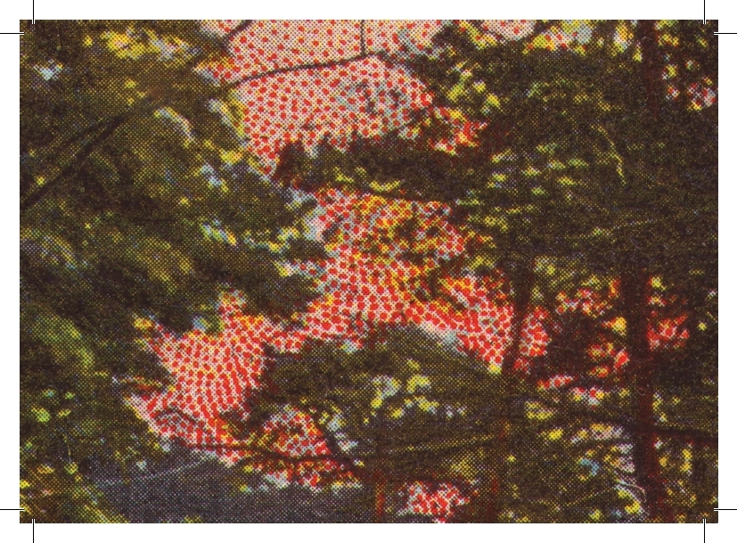
As well as using old postcards in our artwork, we have recently started using postcards to make... postcards. Specifically, a series of art cards offering variations on original motifs of German postcards from around the beginning of the 20th century.

Why?

Well, one of our central aims with the whole Rixdorf Editions project is to introduce a combination of time and place largely unfamiliar in the English speaking world (Wilhelmine Germany) and show how it was actually a crucible for progressive thought that exerted an unacknowledged influence on later eras from the Weimar Republic to the present day.

postcard 2.jpg

Taking original imagery from the time and cropping, blowing up and amplifying the colour symbolises this process by liberating the latent Modernism of the age. There are the dots seen in close up which foretell everything from Pointillism to Pop Art. There are the mismatched colour registrations and their evocative suggestion of new and dynamic graphic realms. And even when (actually especially when) catering to mass market tastes, there are surreal juxtapositions of imagery.

The first series of eight cards is called 'Landscape', referring to both the format and the subject matter, with the source material depicting scenic splendour throughout Germany from Heligoland to the Bavarian Alps. Some of the original cards were photographs, some illustrations, some a strange amalgam of the two.

Anyway, it's just an experiment for now. We'll be including a selection of postcards with each online order until we run out.

postcard 3.jpg

Back in black

We've had some highly gratifying feedback since the first two Rixdorf titles were released to the world in November 2017, but one thing that people never fail to mention is the artwork by designer Cara Schwartz. So with our next two titles imminent we thought we'd give you an insight into how these designs came about, what we're aiming for, what we're drawing from.

Publisher/translator James J. Conway and designer Cara Schwartz at the Rixdorf Editions launch, Berlin, November 2017 (photo: Hilmar Schmundt)

Publisher/translator James J. Conway and designer Cara Schwartz at the Rixdorf Editions launch, Berlin, November 2017 (photo: Hilmar Schmundt)

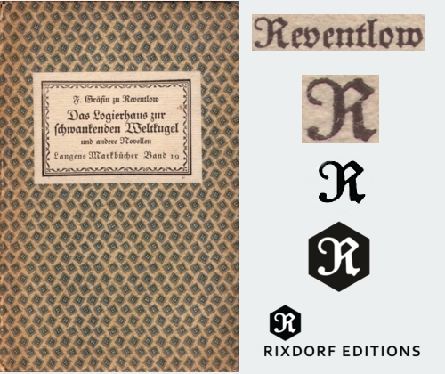
Let's start with our logo. The basic shape is a hexagon or – perhaps – a cube awaiting illumination to reveal its depth. The 'R', in the old German Fraktur script, is taken from the original first edition of one of our first titles, The Guesthouse at the Sign of the Teetering Globe (Das Logierhaus zur schwankenden Weltkugel, 1917), specifically the surname of the author, Franziska zu Reventlow, rendered here as F. Gräfin (Countess) zu Reventlow. Introducing Reventlow to an English-speaking readership is one of our proudest achievements, and we're just as pleased to have her as a guiding presence in our identity.

logo evolution.jpg

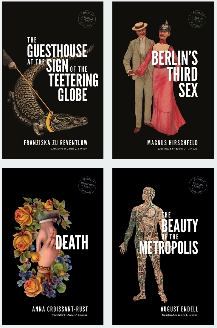
For the book covers, the idea was for the imagery to reflect the times in which the original books emerged (approx. 1890-1918) while avoiding pastiche. Series identity was key; it had to be readily apparent when looking at any two Rixdorf titles that they belonged together. And we wanted to have black backgrounds, partly because they look awesome, partly to reflect the idea of things appearing out of the dim past, much like the books they adorned were emerging from ill-deserved obscurity. The era in question was also the first golden age of postcards, and it is largely to this form that we turned for our graphic elements, having gathered hundred of examples from Berlin fleamarkets.

Rixdorf four covers.jpg

Our English edition of Reventlow's book is a good example of how we incorporate postcard art. One of the most arresting sequences in the collection comes from the title story, in which a reform-minded German eccentric leads a crocodile about on a leash. To represent this we found an old postcard from an establishment called the 'Restaurant zum Neuen Krokodil', which was a stone's throw from Frankfurt's main station, and bagged its scaly mascot for ourselves (incidentally, Google Street View reveals that the building is still standing although the ground floor is now occupied by a branch of the drugstore chain DM). Curiously, the name also echoes the guesthouse of the original German title. For the arm reaching in enigmatically from the side we used a New Year's greeting postcard; Cara diligently removed the snowflakes from the original. And she also suggested that – just this once – we break our self-imposed right-hand margin for the cover text; the word 'teetering' is teetering over the edge. The 'stamp' seen on each cover, another allusion to postcards, records the time and place that the original was written and/or published, in this case 1917 in the Swiss town of Ascona where Reventlow lived for the last eight years of her life.

Guesthouse evolution.jpg

Berlin's Third Sex by Magnus Hirschfeld was a far more challenging work to represent graphically. It covers so much ground – gay men, lesbians, transvestites, transsexuals, prostitution, the demi-monde, high society, nightlife, domestic harmony, law enforcement, blackmail, moral codes. How to get all that in one image? The short answer is you can't, so we decided to lightly recontextualise an example of the era's incredibly extensive and diverse courting imagery. For one half of our happy couple we simply substituted the head of a soldier in the emblematic 'Pickelhaube' helmet. This might seem glib, but in fact Hirschfeld's text reveals that incidents of gay men taking up with obliging soldiers were far from unknown in the era (although full disclosure: they were generally not in drag).

Third Sex evolution.jpg

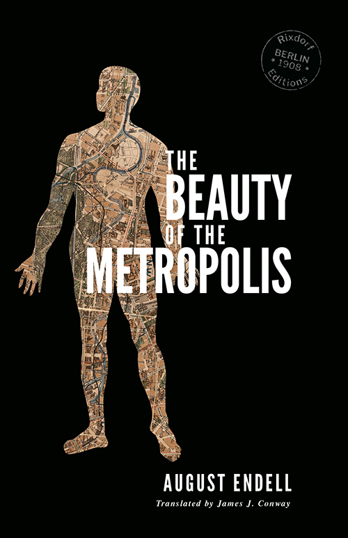
For our forthcoming translation of August Endell's The Beauty of the Metropolis, we tried something a little different. Picking up on the text's reference to 'the street as living entity' we turned this around to make a living entity composed of streets. The connection between the human body and the urban environment is hardly unprecedented ('heart/lungs of the city', 'arterial road'). The body in this instance is an anatomical diagram from a handbook of medical remedies entitled Pfarrer Heumann's Heilmittel, while the streets, parks and waterways are taken from a 1900 map of Berlin, the city referenced throughout Endell's book. Visible in this section are the Tiergarten, the River Spree and the Landwehr Canal, all of which find mention in the text.

Metropolis evolution.jpg

Finally, for Anna Croissant-Rust's Death we returned to our postcard collection. As with the other examples here, the original artist is sadly uncredited. We changed the orientation of the postcard image, but decided it was strong enough not to need any additional elements. As well as the obvious association of death and flowers, and the trope of death as a romantic partner, the image also recalls the motif of joined hands sometimes seen in old mourning jewellery. But which is Death? Is the deceased being pulled up or down? You decide...

Death evolution.jpg

Prepare yourself for Death

It's time we had a little talk about Death – the forthcoming English-language debut by late 19th/early 20th century German writer Anna Croissant-Rust which I translated for Rixdorf Editions.

Perhaps we should start with the author's highly unusual Franco-German name. She was actually born (1860) as Anna Rust in the Palatinate, then part of the Kingdom of Bavaria. But in 1888 she married Hermann Croissant – descended from French Huguenots – and added his name to hers. Bonus fun fact: Anna’s mother-in-law was called Philippine Croissant.

As remarkable a name as it is, even the bookish German of your acquaintance is likely to draw a blank if you mention it. Anna Croissant-Rust sold relatively few books while she was alive and posterity hasn’t been much kinder. And until now, she was one of a large number of women writing enthralling, groundbreaking works in German at the time who have never been translated into English: Maria Janitschek, Elsa Asenijeff, Laura Marholm, Ilse Frapan – to name just a few.

Anna Croissant-Rust

Anna Croissant-Rust

In 1890 Anna Croissant-Rust became the only female member of the Society for Modern Living, a group of forward-thinking Munich-based writers largely associated with the Naturalist movement. But she was already thinking further forward than her male colleagues, and certainly beyond Naturalism. One of her most contentious early works was ‘Wedding’, a tale that relates a bride’s terror of imminent deflowering with pre-Freudian psychosexual frankness; the issue of the journal in which it appeared was promptly banned from sale.

Throughout the early 1890s, Croissant-Rust published works that read like they were conjured from the future, breaking down forms well before ‘breaking down forms’ became a thing in the early 20th century. She was out on her own, fusing free verse and fragmentary narrative in an intense emotional register, but these experiments met with little more than bewilderment at the time. And by the time other writers (usually men) were creating similar work, Croissant-Rust's pioneering work was forgotten. I thought it was essential to highlight Croissant-Rust’s dazzling formal innovation, so the forthcoming Rixdorf edition is actually two books in one: Death, as well as the early book Gedichte in Prosa (Prose Poems). The original publication of Prose Poems (1893) is set in Fraktur, which just highlights its uniqueness. You would struggle to find anything else from this time in the old font – which had defined the look of German books since the dawn of movable type – that was as fearless, as avant-garde, as this. In fact you really have to jump ahead to the pre-WWI Expressionists to find anything comparable.

A page from the original 1893 edition of Gedichte in Prosa (Prose Poems)

A page from the original 1893 edition of Gedichte in Prosa (Prose Poems)

By the time others had caught up, Croissant-Rust’s thoughts were turning to Death. Based on the medieval danse macabre, or Totentanz, Death (1914) finds the Grim Reaper scything through a selection of unfortunates in a cycle of 17 stories. In 'Corn Mother', for instance, it comes to a sick child as an apparition from local lore (related to the 'corn dolly'), in 'Shadows' it appears to be a young woman's own beauty which snuffs out her life, in 'The Bird' it's, well, it's a bird, but the fact that it apparently plucks a man from a cliff and tosses him into a valley suggests this is no normal winged creature. Even in these short tales there is space for mystery and ambiguity. And there's surprisingly little morbidity, in fact if anything it’s a celebration of life and colour and light. Especially light. If nothing else, Death is a thesaurus of the effects of light.

The cover of Der Tod (Death), 1914

The cover of Der Tod (Death), 1914

The original 1914 publication (Der Tod) was a bibliophile edition of 800 copies with illustrations by Willi Geiger showing Herr G. Reaper at work; Geiger was later defamed as a ‘degenerate’ artist by the Nazis. My first reading of the book was a revelation; suddenly not translating it was simply not an option, and later encountering the electrifying originality of Prose Poems merely confirmed that I had to try to bring this largely forgotten writer to a wider readership. Hopefully I have preserved something of the wonder I found in the original. Now that the book is here in Cara Schwartz's beautiful cover I am extremely proud that Death will be available through Rixdorf Editions on 21 May. I can't wait for you to read it.

Death Croissant-Rust cover small.jpg

Visionary of vision

August Endell portrait.jpg

After an unseemly spell of blogging silence we are now emerging from hibernation and full of spring plans. We've just announced the first of our two titles appearing in May 2018 – The Beauty of the Metropolis by August Endell.

Originally published in German in 1908, it wears its 110 years lightly. This is an extremely forward-thinking book that offers a way of visually accessing urban surroundings, even for those of us who know little else. Endell was an architect, a designer and a theorist, and an aesthete more than anything. But for him this didn't mean constructing his own refined environment and retreating into it, but rather finding and appreciating the visual enrichment offered by the things around him. Or in his own words: 'Open your eyes, don’t invent miracles or another world above the clouds; for here in your world you have the kingdom of Heaven.' Endell's love of the city, with all its chaos and squalor, shines through in this book.

Beauty of the Metropolis Endell.jpg

It is typical of Endell's equivocal relationship with posterity that he is best known for a building that no longer exists – the Elvira photo studio in Munich, which opened just weeks before the beginning of the 20th century. Its radical design looked like nothing before it (and frankly not a lot that came after it, either). Just as interesting is the story of the studio's proprietors, Anita Augspurg and Sophia Goudstikker. A lesbian couple who lived in relative openness, they were the first women in Germany to run a company independently of men. You can read more about them in the Afterword to The Beauty of the Metropolis.

Endell Schönheit der grossen Stadt.jpg

And as we were working on the translation we learnt that a museum here in Berlin, the Ephraim-Palais, was planning an exhibition of artworks depicting scenes of the city and which is inspired by Endell's book, even taking its original title – Die Schönheit der grossen Stadt. It's already under way and will be running until late August; we're going along soon and will duly report back. Meanwhile, we'll check in shortly to share news of our other spring title...

Exhibition.jpg

Launched!

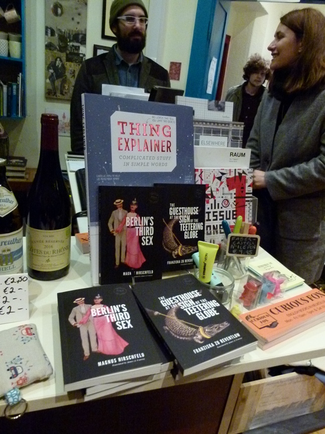
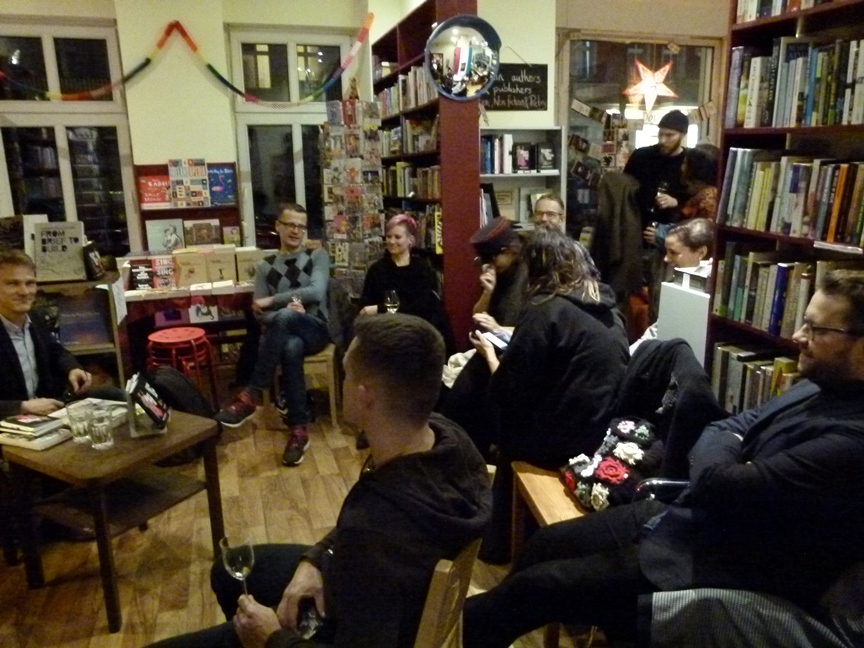
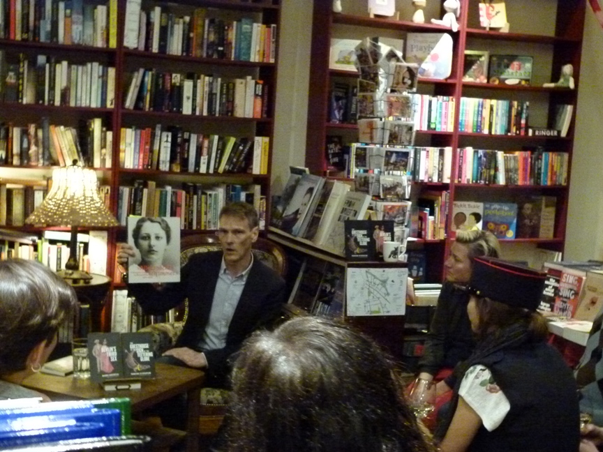
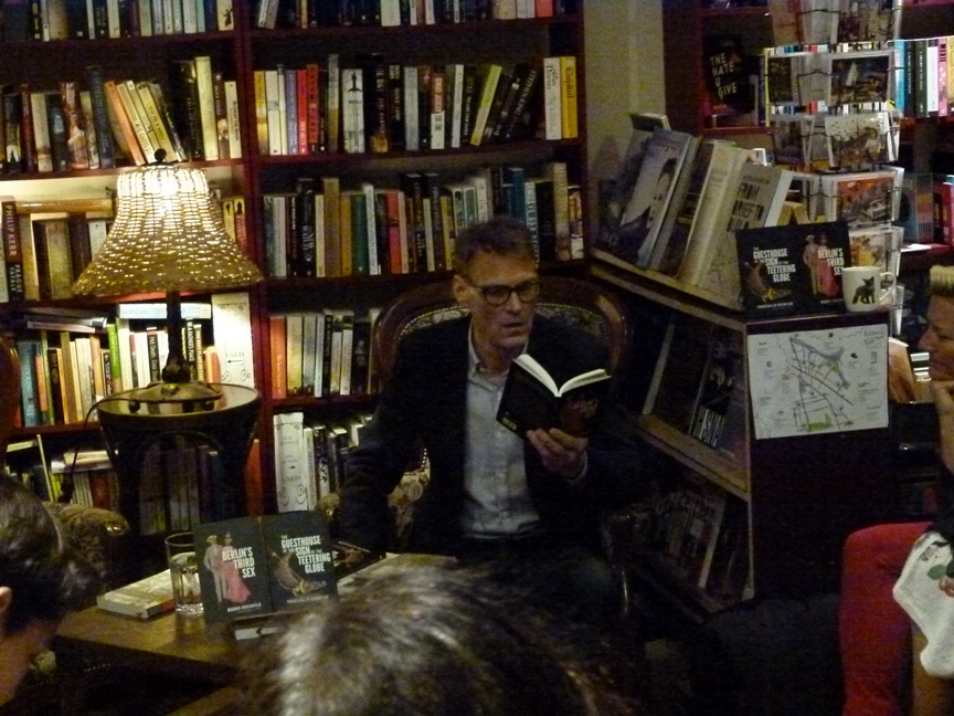
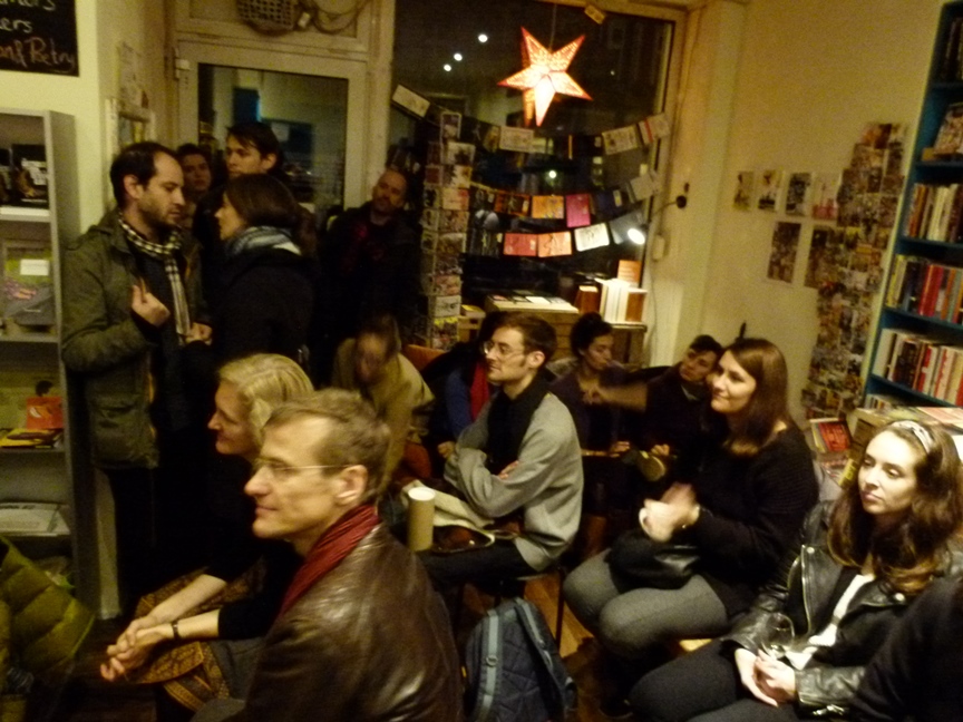
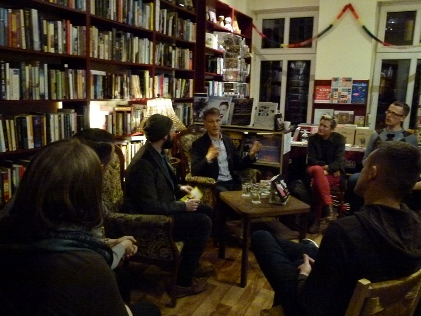
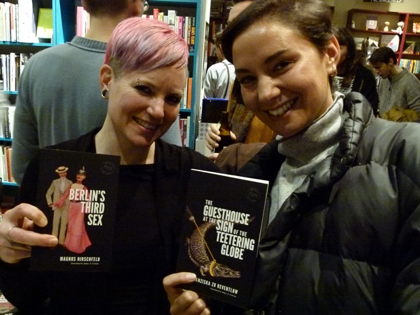
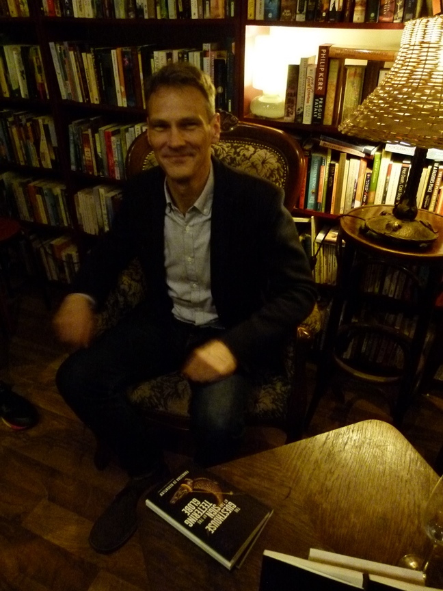
Huge thanks to Dave and Orla of Curious Fox for hosting last night's Rixdorf Editions launch and reading in Berlin, Jodi Rose for organising and taking photos, Cara Schwartz for the brilliant artwork and most especially everyone who came along! It was a fantastic night, with a full house of lovely, attentive listeners and smart question-askers - the best start in life a new publisher could hope for.